Populate a PowerPoint Chart
Three Ways to Populate a Chart
OfficeReports supports three ways to populate a PowerPoint chart:
-
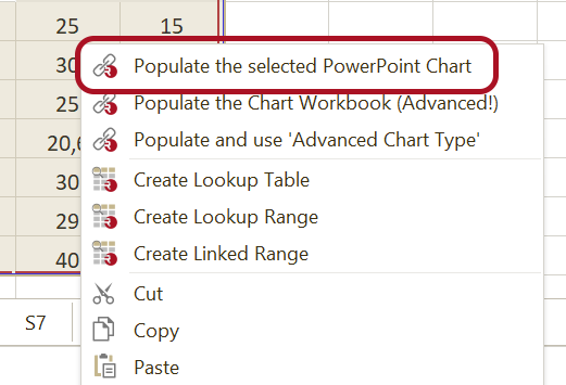
Populate the selected Chart
Links the selected chart directly to the selected data range. This most commonly used method is explained below. -
Populate the Chart Workbook
Writes the selected data to the workbook behind the chart without redefining the chart series automatically. Read more. -
Populate and use 'Advanced Chart Type'
Creates the chart by using one of the advanced chart types in OfficeReports. Read more.
The available chart options depend on whether you work in the Workbook Pane / Workbook Window or in Excel.
Where These Options Are Available
- In the Workbook Pane or Workbook Window, all three options are available.
- When the workbook is open in Excel, only Populate the selected Chart is available, by clicking Populate Selected in the OfficeReports ribbon tab in PowerPoint.
- Populate the Chart Workbook and Populate and use 'Advanced Chart Type' are not available when the workbook is open in Excel.
Populate the selected Chart
Use Populate the selected Chart to link workbook data to a selected PowerPoint chart. After you link the chart, OfficeReports can refresh it when the data changes.
- Select the chart in PowerPoint.
- In the Workbook Pane, select the data range you want to use.
- Right-click the selected range.
- Select Populate the selected Chart.
If you are working in Excel instead of the Workbook Pane:
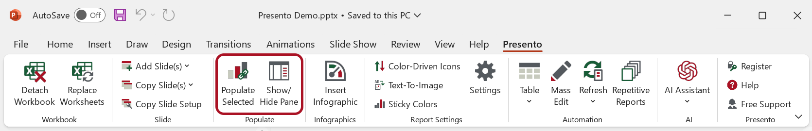
- Select the chart in PowerPoint.
- Select the data range in Excel.
- Click Populate Selected in the ribbon tab in PowerPoint.
After you populate the chart, OfficeReports links it to the selected data range. When the data changes, you can refresh the chart.
When you select a linked chart, the Populated Pane appears on the right side. In this pane, you can change the populate settings.
Conditional Formatting
If the workbook range contains fill colors or font colors, for example from conditional formatting or pairwise significance comparisons, OfficeReports can visualize these colors by using icons in PowerPoint.
Read more about Color-Driven Icons.
Chart Settings
You can change how the populated chart looks in the Populated Pane.
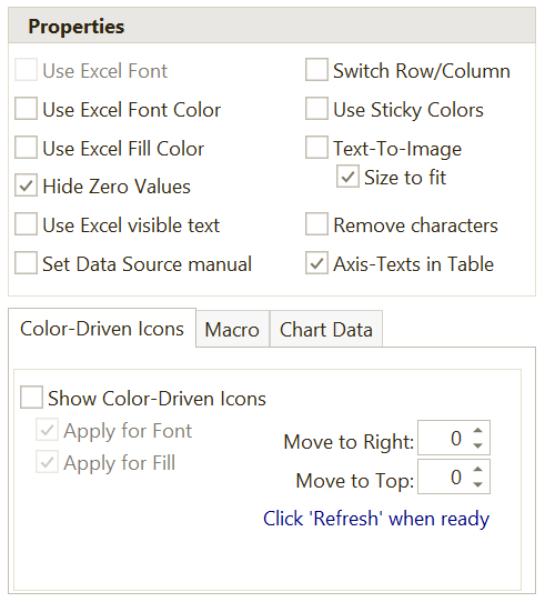
Most chart settings work in the same way as the settings for Tables.
Show Texts in a Table
Use Show Texts in a Table to remove the texts from the chart category axis and place them in a PowerPoint table instead.
This makes the texts easier to format and edit. It also makes it possible to replace texts with images.
Set Source Data Manual
Use Set Source Data Manual to add the data to the chart workbook without defining the chart series automatically.
You must then define which ranges the chart series should use.
Switch Row/Column
Use Switch Row/Column when the chart should use rows instead of columns, or columns instead of rows.


Use Sticky Colors
When several charts contain the same categories but are sorted differently, it can be difficult to compare them visually.
Use Sticky Colors to keep category colors consistent across charts.


Read more about Defining Sticky Colors.
Use Excel Fill Color
Use Excel Fill Color to override the default PowerPoint chart colors based on the fill colors in the linked Excel range.
For example, the colors of bars, columns, or lines can be based on Excel cell fill colors.


Text-To-Image
Use Text-To-Image to replace chart texts with images.
This only works if you selected Show Texts in a Table when you linked the Excel range to the chart.
You define which image to use for a specific text in Text-To-Image in the ribbon tab.


Show Color-Driven Icons
Use Show Color-Driven Icons to show icons in the chart based on workbook cell colors.
This works the same way as for tables. Read more in Populate a Table.
VBA Macro
If OfficeReports does not include the functionality you need, you can extend it by running a VBA macro.
For example, the macro ORTop2Bracket adds brackets to the chart.

Read more about VBA Macros.
Handle Overlapping Data Labels
Depending on the selected chart type, the Populated Pane may include a Chart Labels tab.
For example, when you edit a stacked column chart, the Chart Labels tab is available.

Check Repositions overlapping labels to move data labels so they do not overlap.

Check Color fill squeezed label boxes together with this option to improve the appearance of labels in tight spaces.
