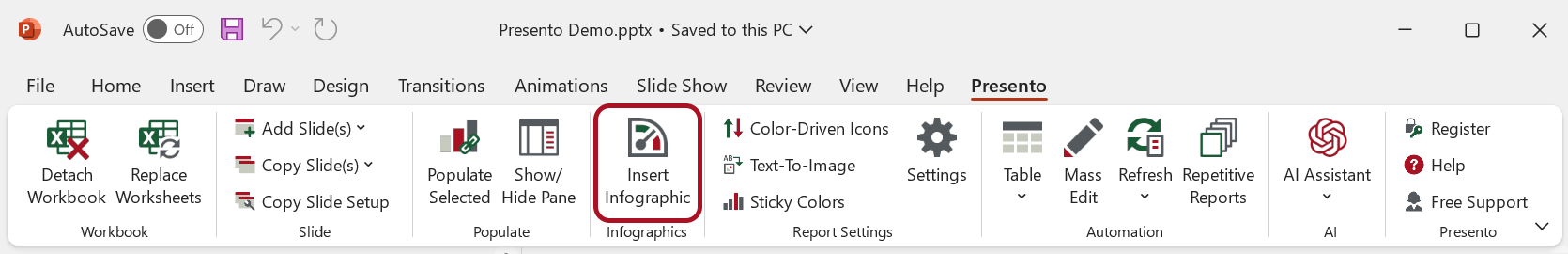
Infographics
Use Infographics to insert, edit, and populate infographic elements in PowerPoint.
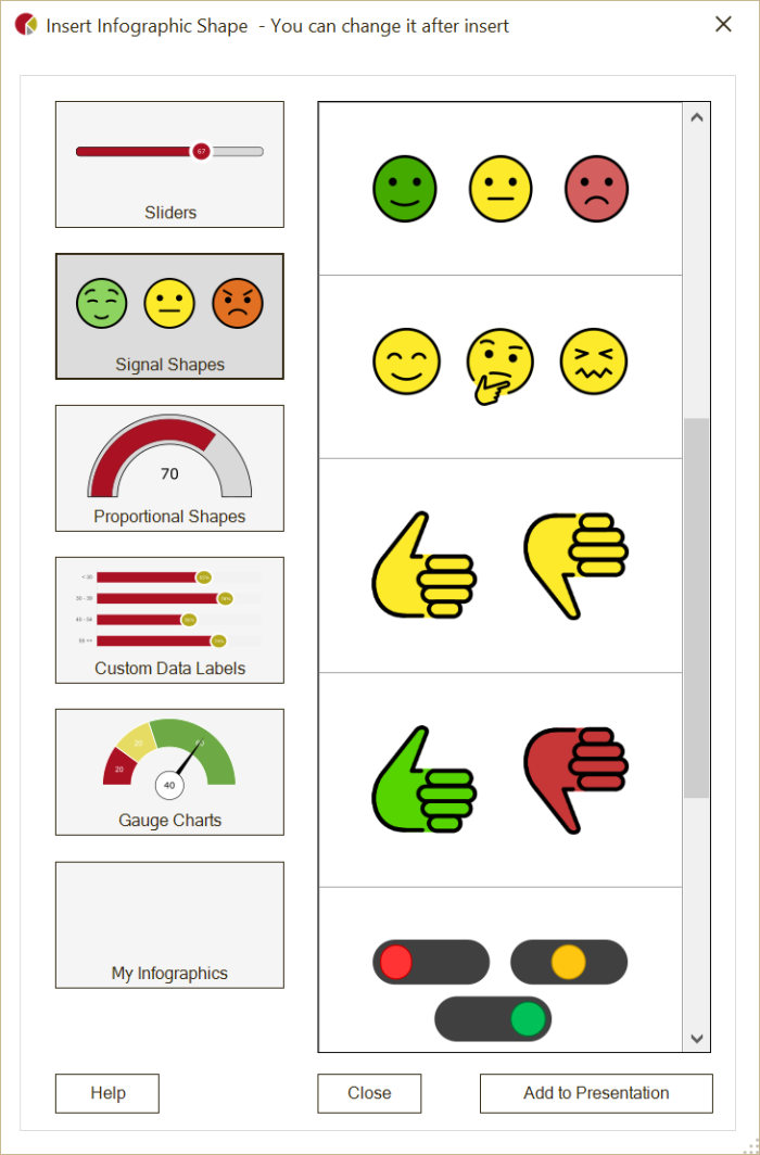
OfficeReports infographics are groups of PowerPoint shapes. In the Infographics window, you can choose between sliders, signal shapes, filled shapes, custom data labels, and gauge charts, and then add the selected infographic to your presentation.
Insert, Edit, and Populate Infographics
After you add an infographic, you can use standard PowerPoint functionality to change its elements. For example, you can change colors, borders, and sizes.
Infographics are populated in the same way as other shapes and charts:
- Populate sliders, signal shapes, proportional shapes, and gauge charts with a single value.
- Populate custom data labels in the same way as charts.
Save in My Infographics
Save an infographic in My Infographics when you want to reuse it.
- Right-click the infographic.
- Click OfficeReports -> Save in 'My Infographics'.
You can also add infographics to the slides in your Slide Library.
Create Your Own Infographics
Because OfficeReports infographics are groups of PowerPoint shapes, you can create your own infographics.
- Select an infographic.
- Open the Selection Pane by pressing
Alt+F10. - Review the names of the shapes in the infographic.
To make OfficeReports recognize the infographic correctly, follow the naming rules for the infographic type.
Sliders
A slider must be a group whose name starts with ORSlider.
The group must contain shapes with these names:
Base: Add the default minimum and maximum bounds afterBase, for exampleBase 0 100. You can change these values after populating.PointorDataPoint: OfficeReports positions this shape relative to the base when populated. If the shape is namedDataPoint, OfficeReports writes the value inside the shape.Bar(optional): OfficeReports resizes this shape so it is visible from the start of the base to the point or data point.
You can add other shapes to the group, such as a background.
Signal Shapes
A signal shape must be a group whose name starts with ORConditionalShape.
The group can contain any type of shape. The name of each shape in the group must include the minimum and maximum bounds for that shape. These bounds define which shape is visible when the group is populated with a specific value.
If the value is outside all defined bounds, the group is invisible.
Filled Shapes
A filled shape must be a group whose name starts with ORFilledShape.
The group must contain two shapes of the same type, for example two Arc shapes or two identical icons with different colors.
Use these shape names:
Base: Add the default minimum and maximum bounds afterBase, for exampleBase 0 100. You can change these values after populating.Bottom,Left,Top, orRight: This name defines where OfficeReports starts filling the shape. This shape should use the color you want for the filled part.
Custom Data Labels
A custom data label must be a group whose name starts with ORGraph.
The group must contain:
- a bar chart or column chart named
Chart - a shape named
DataPointEndorDataPointCenter, depending on where you want the data label to appear
You can also add an optional shape named Fill when you use a bar chart or column chart. OfficeReports extends the bars or columns to 100%.
Gauge Charts
A gauge chart must be a group whose name starts with ORGauge.
The group must contain these shapes:
Needle: This shape points to the populated value.DialorDialData:Dialcan be either a Doughnut chart or an Arc shape.DialDatacan only be used for Arc shapes and shows the populated value in the shape. Add the default rotation scale and the minimum and maximum bounds after the name, for exampleDial -90 90 0 100. You can change these values after populating.CenterorCenterData(optional): OfficeReports places this shape at the start point of the needle. Use it to improve the appearance of the needle. If the shape is namedCenterData, OfficeReports shows the populated value in the shape.Data(optional): This shape shows the populated value.
You can add other shapes to the group, such as numbers along the dial.
If the dial is a chart, you can populate the chart by selecting it within the group and then populating the values you want to show.