OfficeReports Introduction
OfficeReports is software for data analysis in Excel® workbooks and data visualization in PowerPoint® presentations. It includes an app similar to Excel and add-ins for both PowerPoint and Excel.
Data Visualization in PowerPoint Presentations
OfficeReports links ranges from Excel workbooks to PowerPoint shapes, tables, and charts. It uses the content of these ranges to populate them.
You can also use the font color and fill color in the ranges to display icons in tables and charts. When the data in the ranges changes, OfficeReports can update the presentation and show the new data.
The result remains a native PowerPoint presentation that contains native PowerPoint shapes, tables, and charts. Anyone using PowerPoint can open and edit the presentation.
Work with Already Aggregated Data
When you work with already aggregated data, such as crosstabs in a workbook, read more about Lookup Tables, Lookup Ranges and Linked Ranges. These concepts help you create ranges from standard crosstabs so you can populate shapes, tables, and charts in PowerPoint.
Work with Raw Data
When you work with raw data, such as SPSS datasets or workbooks containing data records, read this:
Special Chart Types
OfficeReports can create specific chart types and infographics that are difficult to create manually. Examples include Rotated Line Chart, Diverging Bar Chart, Quadrant Chart, XY Chart with label-table, Funnel, Sliders, and Signal Shapes.
Read more about Data Visualization and Visualization Settings.
Special Infographics
OfficeReports can visualize your data in sliders and similar infographic formats. Read more about Infographics.
Productivity
OfficeReports can organize worksheets by attaching them to slides. This makes it easier to copy slides because the attached worksheet is copied automatically, including any editable table definitions it contains.
This can make slide creation much faster. Read more about Productivity in PowerPoint.
Analyze Data in Excel Workbooks
After importing your data file, you can create tables.
The OfficeReports App
You can use both the OfficeReports App and Excel for data analysis. The app is faster than Excel and lets you create tables by dragging variables from the Data Editor and dropping them on the spreadsheet.
The OfficeReports App also shows OfficeReports functionality when you right-click an empty cell, a table, or a worksheet tab. The app reads and writes Excel workbooks and is fully compatible with Excel.
The app does not support macros. It also does not support spilled array formulas such as XLOOKUP and SORT. If you need this functionality, you must update the workbook in Excel or work in Excel all the time.
The following topics are the same in both the OfficeReports App and Excel.
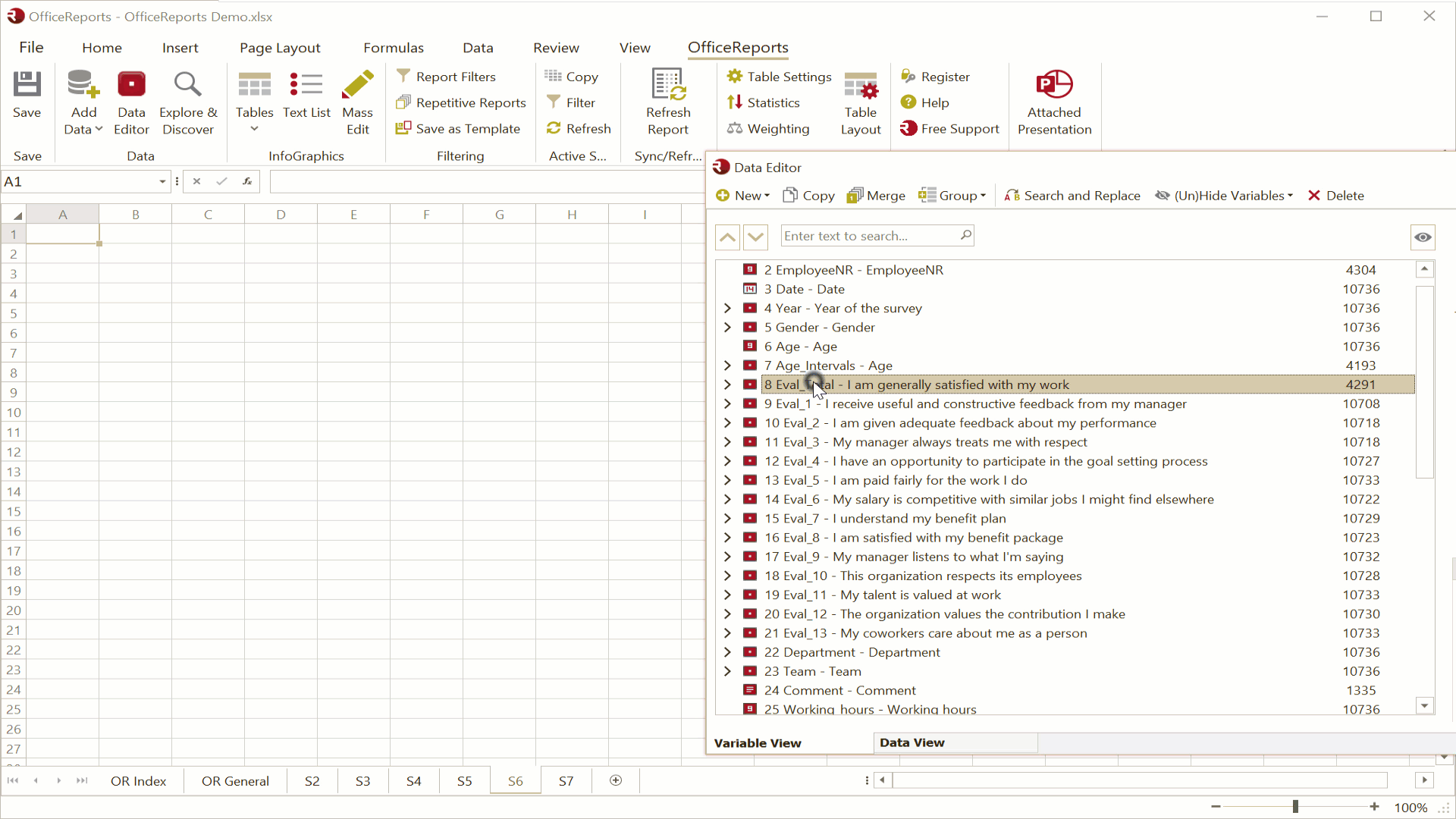
The Data Editor
The Data Editor gives you an overview of your data in both Variable View and Data View. You can also recode your data here if needed.
Read more about the Data Editor here.
Explore Data
Before you create specific crosstabs, you may want to get an overview of your data using Explore Data.
Create Tables
Read more about table and list types, including crosstabs, grid tables, aggregate tables, low/high tables, and verbatim lists here.
Bulk Create Tables
You can Bulk Create Tables at one time.
Batch Reports
You can use OfficeReports both for bulk generation of reports and to update an existing report with new data. This makes OfficeReports useful for reporting tracking surveys.