Table Layout
Use Table Layout to define how OfficeReports crosstabs and tables look.
A table layout controls:
- how values are arranged in the table
- which statistics are shown
- how significance is displayed
- how tables are formatted for Excel or PowerPoint
- which standard texts and significance colors are used
Two main types of table layouts
In OfficeReports, table layouts are typically used in two different ways.
Analytics layouts
Analytics layouts are designed for data analysis in Excel.
They are standard market research crosstab layouts and are meant to be read directly by the analyst.
An analytics layout typically:
- shows multiple values in the same table, such as counts, percentages, and significance characters
- keeps the full crosstab structure visible
- is optimized for analysis, checking, and interpretation in Excel
Examples include layouts such as OR Analytics.
Reporting layouts
Reporting layouts are designed for data visualization in PowerPoint.
These layouts should be used when populating PowerPoint tables, charts, and shapes from Excel ranges.
A reporting layout typically:
- uses Populate Layout (for PowerPoint)
- separates table statistics such as Base, Total, and Mean from the main result area
- shows only one main value type at a time, such as count, percentage, Top 2, or Mean
- uses significance colors instead of significance characters
This makes it easier to select a clean Excel range that contains exactly the values needed for PowerPoint.
Examples include layouts such as OR Reporting.
Why reporting layouts are different
When you populate PowerPoint, you usually do not want a standard crosstab cell that contains several pieces of information at the same time.
For example, a normal analytics crosstab cell may include:
- count
- percentage
- significance character
That works well for analysis in Excel, but not for PowerPoint visualization.
A reporting layout is designed so that:
- the Excel range contains exactly the values you want to visualize
- significance is shown by color
- PowerPoint can use those colors for visual elements such as arrows or icons
This is especially useful together with Color-Driven Icons.
Default Table Layout
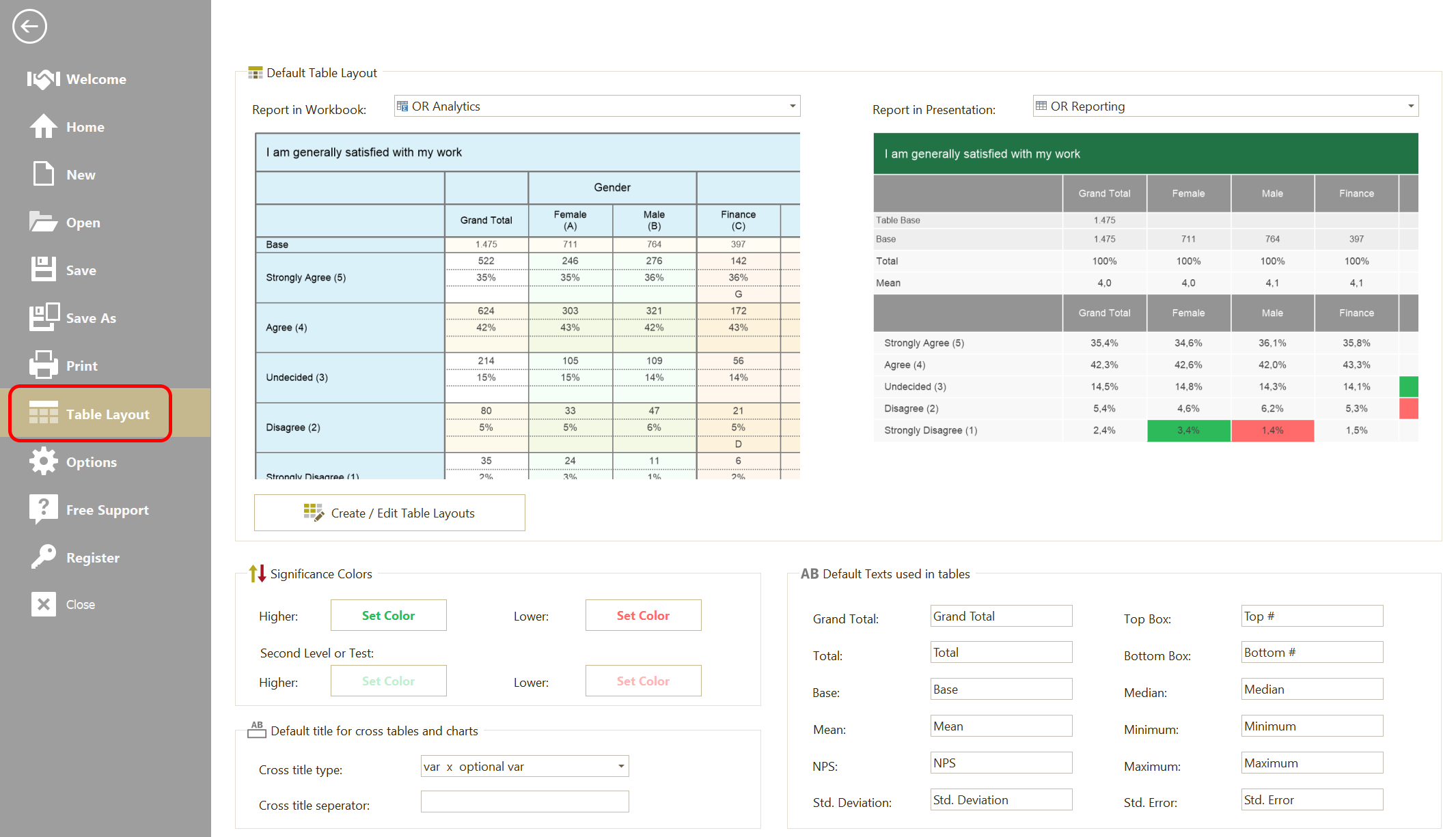
In Table Layout, you can:
- Set the default layout for Workbooks
- Set the default layout for Presentations
- Open Manage Table Layouts
- Change significance colors
- Change the default texts used in tables
The workbook layout is usually an analytics layout.
The presentation layout is usually a reporting layout.
Significance Colors
Significance colors are especially important for reporting layouts.
In analytics layouts, significance is often shown with significance characters.
In reporting layouts, significance is usually shown with colors.
Important: The significance colors are shared across reports. If you change them, the new colors are also used when you refresh older PowerPoint presentations and Excel workbooks.
Default Table Texts
Use Default Table Texts to define the standard labels used in tables.
This includes:
- Grand Total
- Total
- Base
- Mean
- NPS
- Std. Deviation
- Top Box
- Bottom Box
- Median
- Minimum
- Maximum
- Std. Error
These texts are used by layouts that display these table elements.
Manage Table Layouts
Click Manage Table Layouts to create, copy, edit, import, export, or delete layouts.
When you manage layouts, you can define:
- Properties
- Areas
- Borders
- Colors
OfficeReports shows a preview table so you can immediately see the effect of the selected layout.
Properties
Use Properties to define general layout behavior, such as:
- row heights and column widths
- whether the layout is a Populate Layout (for PowerPoint)
- whether significance is shown next to percentages in compact layouts
- whether
TotalorMeanis shown in the first column - whether the
%character is shown - whether equal results are sorted alphabetically
- whether final Excel results are rounded
- whether cells in Row 1 are merged
- whether significance colors are inverted
- whether banner variables are separated by empty columns
Read more about Edit Table Layout - Properties.
Areas
Use Areas to define the formatting of text areas and value areas in the layout.
Examples include:
- Row 1
- Row 2
- Column 1
- Count
- Percentage
- Base
- Total
- Mean
- Std. Deviation
Read more about Edit Table Layout - Areas.
Borders
Use Borders to define the border elements used in the layout.
Read more about Edit Table Layout - Borders.
Layout levels
OfficeReports lets you choose layouts at different levels.
Default layout for Workbooks and Presentations
Use Table Layout to set the default layout for:
- Excel workbooks
- PowerPoint presentations
Layout for a specific workbook or presentation
You can override the default layout for a specific workbook or presentation.
To set the layout for a specific report:
- Open the OfficeReports ribbon tab.
- Click Table Layout.
Layout for a specific table
You can also override the layout for an individual crosstab or table.
To set the layout for a specific table:
- Edit the table
- Click the Layout tab
- Choose the required table layout
Which layout should I use?
Use an analytics layout when:
- you want to read and analyze the crosstab directly in Excel
- you want counts, percentages, and significance characters in the same table
- the table is mainly for analysis, not for PowerPoint population
Use a reporting layout when:
- the table is used as a source for PowerPoint
- you want a clean range with exactly one type of value
- significance should be shown by color
- totals and summary statistics should be separated from the main table body