Significance Testing
Use significance testing to identify statistically significant differences in tables and charts. You can define both T-Test and Z-Test settings, and you can define which columns are compared and how significant differences are shown.
You can test all columns against Total and define specific column combinations to test.
When you apply significance testing to a table or chart, OfficeReports opens the significance settings window.
You can also open this window by clicking the button below.

Significance Calculation Settings
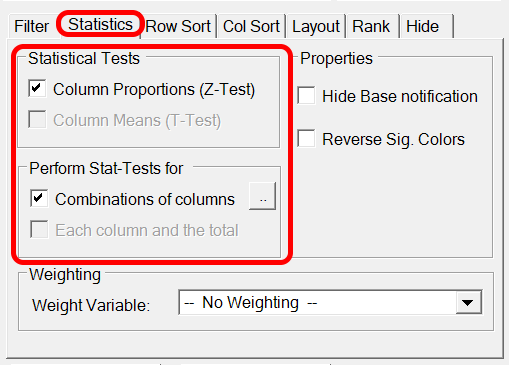
Use the Statistics dialog to define the statistical methods and thresholds. Here, you can also define if OfficeReports should calculate siginificance difference at 2 confidence levels at the same time.
Define Significance Testing
- Open the significance settings for the table or chart.
- Select whether to use a Pairwise Test or define specific column combinations.
- Define how you want to visualize significant differences.
- Click OK.
If you click OK without changing any settings, OfficeReports tests all columns against all other columns and shows the result by using significance characters.
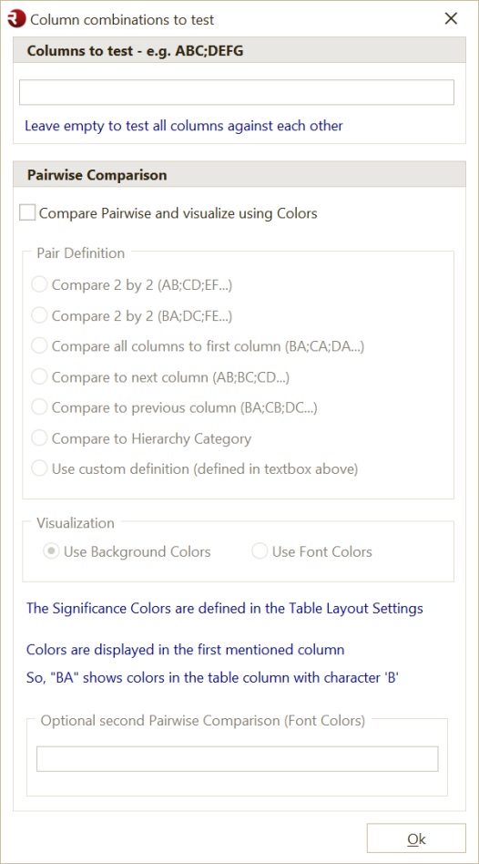
Define Column Combinations
You can define groups of columns to compare.
For example, enter ABCD;EFG to compare:
- columns A, B, C, and D with each other
- columns E, F, and G with each other
Pairwise Test
Use a Pairwise Test when you want to compare columns in pairs.
When you use a pairwise test, OfficeReports uses background colors or font colors to show significant differences, instead of significance characters
Use one of these 'predefined' column combinations:
firstto compare all columns to the first columnnextto compare each column to the next columnpreviousto compare each column to the previous columnABto compare columns in pairs such as AB, CD, EF, and display the result in the first column of each pairBAto compare columns in pairs such as BA, DC, FE, and display the result in the second column of each pairSegment Categoryto compare all columns to the 'active' Segment Category (Used for Bulk creating 'Brand' reports, where we create a report for each brand in a Segment Filter)
You can also use a custom definition by specifying a pairwise list of the columns to compare.
If the final output is a PowerPoint presentation, a pairwise test is often the best choice. OfficeReports can use the Excel colors to display significance arrows or other shapes in PowerPoint.
Read more about Color-Driven Icons.
Notes
Note: OfficeReports shows significance colors in the first mentioned column. For example,
BAtests columns A and B and changes the background of the value in column B, in case there is a significant difference.
Note: The significance colors are defined in Table Layout.
Note: The method and confidence levels are defined in Statistics.
Note: By default, OfficeReports shows significance characters as superscript. You can change this in Settings.
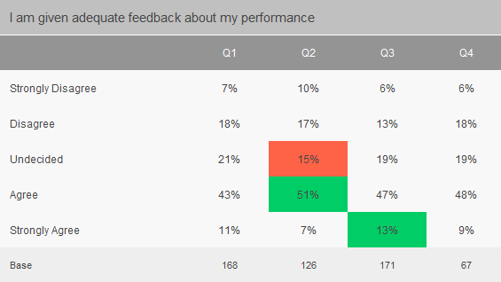
Example
This example shows the result of a pairwise test that uses fill colors to display significant differences.